
Microsoft Excel is one of the most frequently encountered administrative and financial tools in the business world, and is used for an almost infinite variety of purposes.
However, working with large Excel sheets can be a challenging task. The raw data is there, but it can seem difficult, if not impossible to make sense of it, filter it, or extract the key information you need.
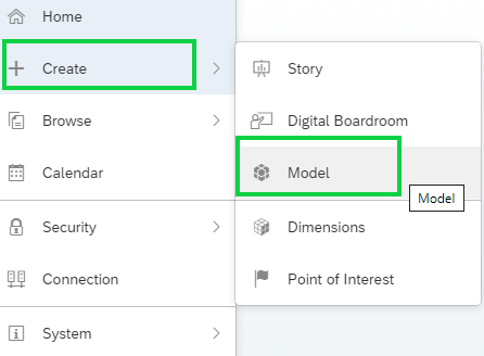
That’s where the SAP Analytics Cloud comes into its own. This self-service tool allows even non-expert users to analyse and report on large data sets without the need for coding, query writing or building complex formulas. Instead, the user can use natural language commands to interact with and model the data, creating sophisticated reports quickly, easily and most importantly, accurately.
As a web application, it’s available wherever and whenever it’s needed, and the information collated can be shared via the cloud for a global audience. From startups to blue-chips, organisations across all sectors are using SAP Analytics Cloud to empower executives to make real-time, data-driven decisions without uncertainty or delay.
Let’s see how simple SAP Analytics Cloud is to use in a practical scenario. Our example is the sales department of a multinational firm, using Excel to store extensive sales records. We’ll show how an analyst would use SAP Analytics Cloud to interrogate the dataset and create and share “Stories” - visualisations of key data for a nontechnical audience.
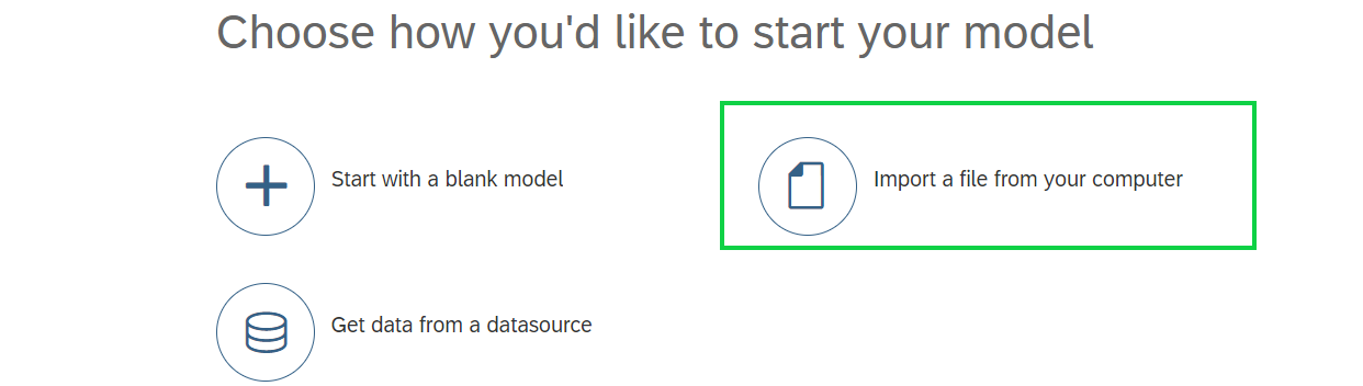
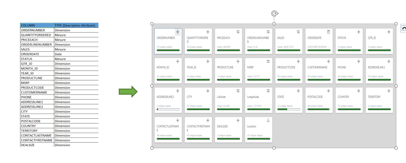
From the home screen, it takes only a few clicks to create a new data model, and add a source - our Excel file. The visual interface then allows us to map each column in the Excel sheet to a field in the data model, adding new fields if required.
With the data model confirmed, we can now create a “Story”. This is a specific visualisation of selected data which can be shared on the cloud in real-time with other users. We can create multiple stories from the same data source to highlight different aspects of the data, or to tailor the stories for different audiences.
Each story is designed to allow the reader to gain a rapid understanding of the nuances of the data and take the best operational and strategic decisions.
Stories come in two formats - Canvas or Responsive.
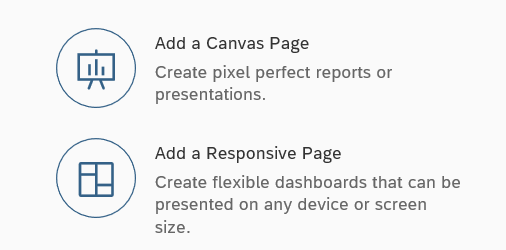
Canvas gives you a pixel-perfect layout with every element locked in place. It’s perfect for printed reports, brochures and prospectuses, or for large high resolution displays e.g. at a conference or seminar.
Responsive is, you guessed it, a responsive layout which adapts and rearranges the content to suit the device on which it’s being viewed. It’s ideal for distributing reports to individuals to be viewed on their phone, tablet or laptop.
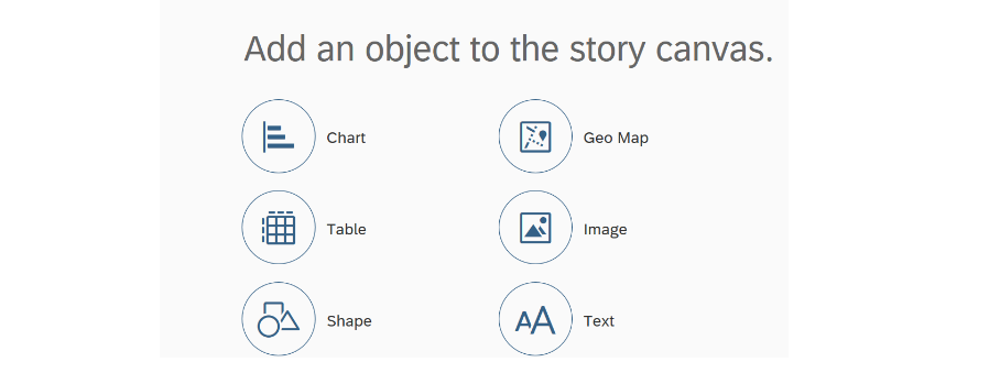
In either case, the story is built up from a number of objects. There are a wide range available, including (but not limited to):
Comparison Graphics
Trend Graphics
Distribution Graphics
Correlation Graphics
Indicators
Percentages
Marimekko
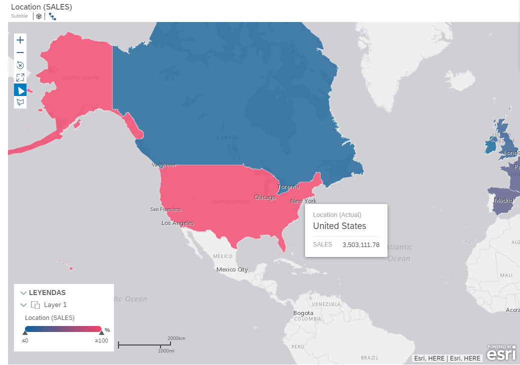
Geomaps
Tables
Images
RSS
We can choose to start from scratch, adding our choice of objects, or for a head start use one of the many premade templates available. These reflect the most common report types and structures, but can be edited or tweaked to meet our precise needs. When we’ve set up the template just how we want it, the layout can be saved as a custom template for future use.
Alternatively, we can simply click “Build My Story For Me” and let the system create a template based on its analysis of the source data - again, this can be edited further later.
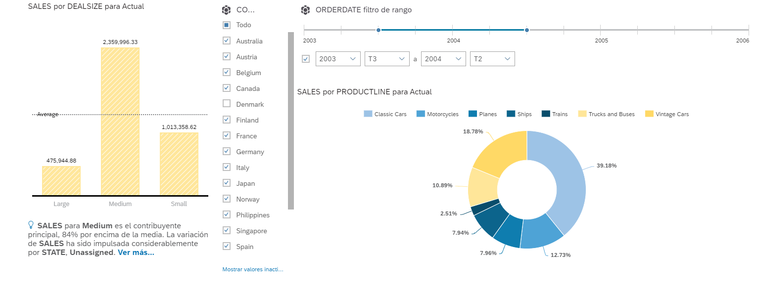
Each element, whether it’s a chart, table, map or scale, can be further edited to display the relevant information in the most accessible way. For example, a bar graph of sales per branch could have a threshold applied to apply different colors illustrating which branches were hitting their target and which were behind.
The newly created story can then be shared with its intended audience, either internally to other SAP users, or as a PDF via email. In the former scenario, users can comment on specific areas of the story, tasks can be assigned against certain items and a discussion can be created for multiple users to share thoughts on the story.
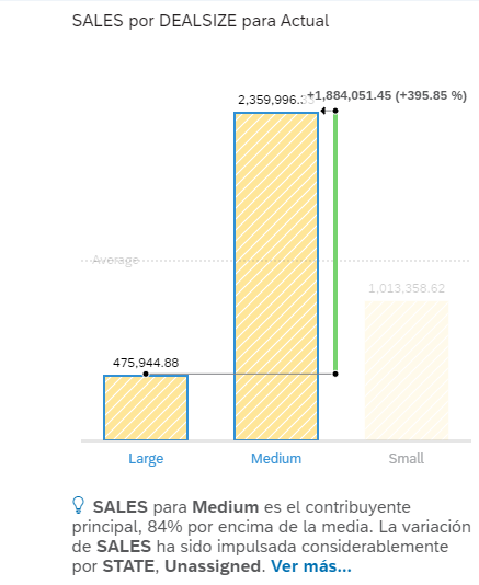
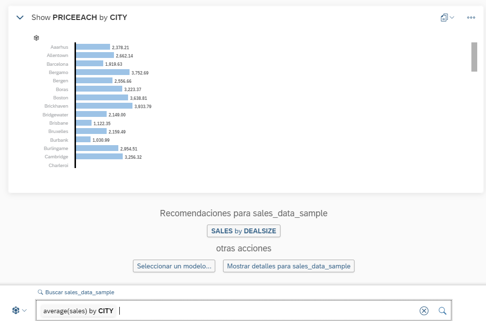
Clicking on graphic elements brings up further information, such as more detailed figures, ratios, comparisons etc. But users can also benefit from SAP Analytics Cloud’s conversational intelligence to obtain additional insights using natural language commands.
All that is needed is to pose a question to the application through “Search to Insight”.

We could ask for “average (sales) by CITY” to generate a bar graph showing the relevant data, or alternatively create a geomap view showing the information as a color coded map.
The examples above can only begin to give you an insight into the breadth and depth of information available via SAP Analytics Cloud Stories - there’s much more available than can be covered in a single article.
We’ll publish more posts about using SAP Analytics Cloud in a practical business context soon. In the meantime, if you have questions about what you’ve read, or feedback to share, please let us know.