The scale in graphs for WebI is something that can be left as automatic or it can be hardcoded by introducing figures. However it is always preferable to select the automatic set up for the following two reasons: firstly because when a new value is added to the graph, it won’t out of scale, and secondly if the graph is located inside a section, the user will always enjoy the optimal graph size. But automatic scale has an issue when dealing with combined graphs. For example, if what we want to compare from the Y and Z Axis needs to be in the same scale, WebI creates two different scales. To help you with this challenge, this article will show you a workaround so you can have identical scales for all graph Axes, preserving the native dynamic feature of the scale.
The Workaround Let's imagine the example of a combined graph with bars and lines. And imagine that your sales department wants to see the sales in bars and the target in lines, in a monthly evolution. The chance that the bars and lines will have the same scale is low, because targets normally are higher than the sales. As a result users cannot compare both pieces of information, even if they are shown in the same units.
A workaround to get to see target and sales in the same scale is the following:
- Create a measure with the highest value by month of the sales
- Create a measure with the highest value by month of the targets
- Calculate the maximum value between the two of them
- Allocate this dummy value in the last month shown of the graph and store it in a new measure
- Drag & Drop this last measure in both Axis (Y and Z) and paint the result in the same color as the background, so it is not seen
The Result
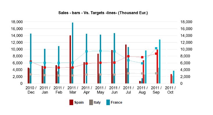
The graph will have the following look & feel:
Notice that if we decide to go for grid lines, these ones will have a small defect when it comes to the place where the dummy bar is shown. This is a small price you have to pay for the great functionality achieved, but remove the grid if you prefer and the result will be absolutely professional.
Conclusion This workaround adds value to the user who is looking for two measures being compared graphically and wants to always have the optimal data size automatically. If you have questions about this method, or if you want to share your experience or tips, please feel free to leave a comment!

