
Dashboards allow us to present data in a variety of creative ways which allow complex information to be analyzed at a glance. Along with charts and tables, maps are an increasingly common format, and with SAP Analytics Cloud it’s never been easier to create them, even without technical training. In this article we’ll look at the process for adding custom maps to SAP Analytics Cloud Stories, using a case study as an example.
One of our clients, which is in charge of providing emergency call response in Cataluña, Spain, wanted to visualize data related to these calls using a map.
We proposed to use SAP Analytics Cloud because of the capabilities that the tool has and fits on the customer requirements, BI, Smart Predict and Planning. This would allow the client to make accurate predictions about future call times and locations based on historical data and would facilitate the deployment of staff to the right areas, allowing for more effective emergency coverage and lower response times.
When it comes to showing Geographical Data with Geo Map in SAP Analytics Cloud Story, the data has three different levels. The client wanted to use drill-down capabilities, and it became clear that using a Standard Geo Map was not sufficient, because one of the levels of map data required by the client was a Custom Map.
We started to work on a method to solve this, i.e. how to import a custom Map and how to show it in Geo Map. There is already a simple way to add custom maps to SAP Analytics Cloud, which is the Points of Interest Layer of Geo Map.
However, the problem with the Points of Interest Layer is that it can show only the borders of a Polygon, it can’t show any data and it doesn’t have Drill-Down capabilities.
Another option, identifying the longitude and latitude of each data item and representing it using pinpoints in Geo Map, was also deemed unsatisfactory, as the client needed to show regional borders which defined areas rather than single points.
The solution we came up with involved using the SAP Cloud Platform (SCP) via Live Connection. With this method, custom maps can be imported to SAP Cloud Platform with HANA Studio/Eclipse, and these custom maps can be combined with the standard maps available in SAP Analytics Cloud. Different hierarchy levels can be defined, and the drill-down capabilities of Geo Map can be used, making it a perfect solution for analyzing hierarchical data. Let’s look at how the method works in practice.
Before applying the method, various prerequisites and resources had to be checked and installed. The relevant points we had to consider were:
The proper IDE version must be installed and to connect SCP Hana Database, the configuration must be set.
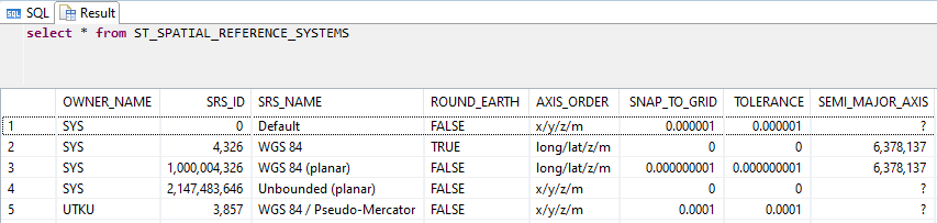
ESRI shapefiles must be selected and imported carefully because the Spatial Reference Identifier (SRID) could be different for each shapefile depending on the source.
Four SRIDs are defined by default, additional ones should be registered by predefined codes - which can be found online by searching each SRID.
The image below shows the three stages of the process, with events grouped into:
Before applying the method
Within Eclipse/HANA Studio
Within SAP Analytics Cloud

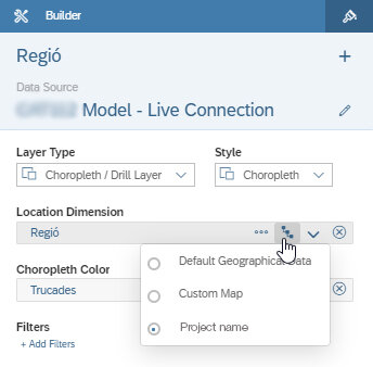
After creating the Calculation and Attribute Views, and adding a new hierarchy level to the default hierarchy table, the SAP HANA side is completed. Now, we have to create a new model in SAP Analytics Cloud and then access the data in SCP via Live Connection and create a Location dimension to use in our SAP Analytics Cloud Story.
Finally, we have to create an SAP Analytics Cloud Story and review the result. Once that’s complete, the only tasks remaining are adding a Geo Map and linking it to the new model, selecting the Choropleth/Drill Layer, selecting the Location dimension and lastly selecting the custom map hierarchy from Builder.
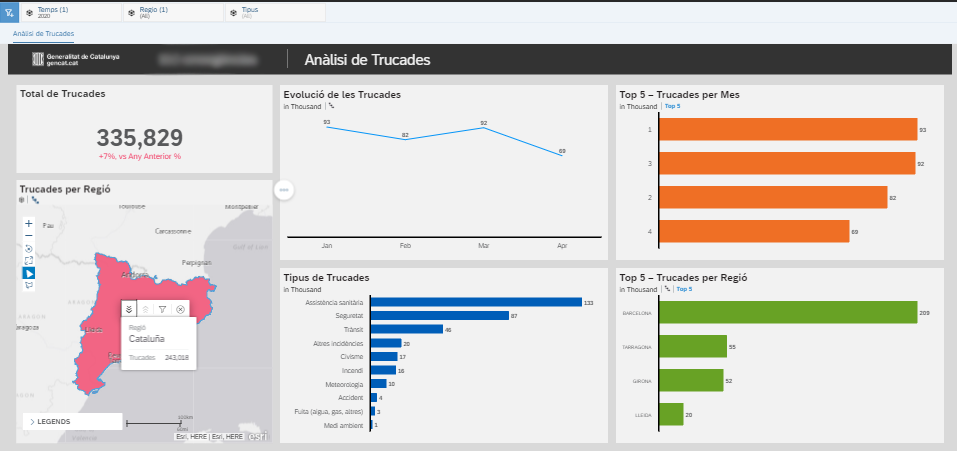
Finally, we get to see the results!
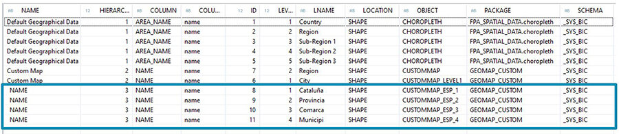
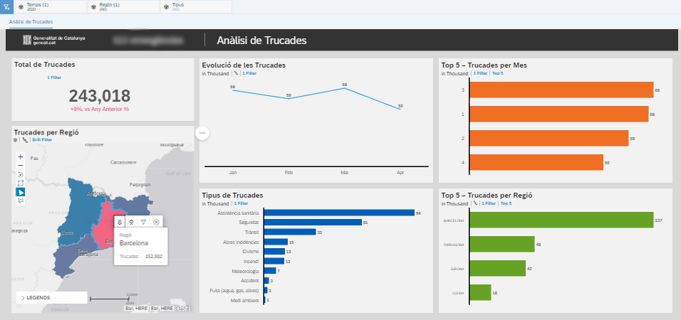
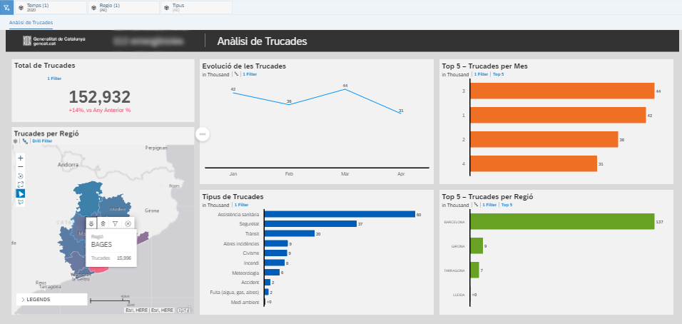
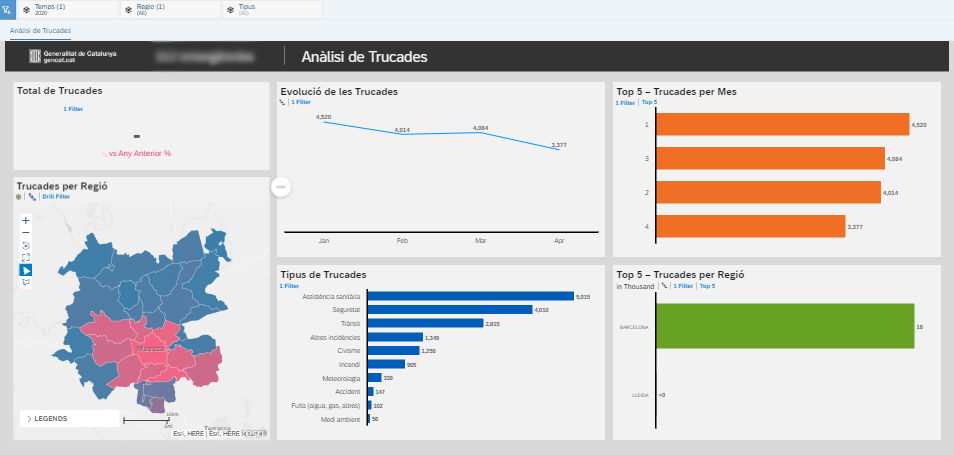
This SAP Analytics Cloud Story has various different types of charts, Geo Maps and Story filters. Most have the drill-down and Linked Analysis options available. The Geo Map is linked to a custom hierarchy, and this hierarchy has four levels. These levels are Cataluña, Provincia, Comarca and Municipio. For each level, different shapefiles are imported and different Attribute Views are created in SCP.
Conclusion and Benefits
SAP Analytics Cloud’s default map hierarchy includes countries, cities, regions, etc. and the borders of each level are pre-defined. But it does not fulfill every need. Lower level maps do not exist, such as city districts (not in all countries), neighborhoods, streets, or buildings. Some clients prefer to create their own regional maps, in these maps, borders and so forth may be different from the administrative boundaries of country, city, etc. The method outlined above allows you to use custom or third-party sourced maps to fill that gap.
The key benefits of the method include:
Using drill-down capabilities of Geo Map by importing your own custom maps
Storing and accessing transactional data and custom map data in one place
Importing multiple custom maps, and using them together or in individual cases
Combining custom and default maps
Using the spatial functions of SAP HANA
There’s nothing worse than knowing you have relevant geographical data but being unable to effectively leverage it to inform your decisions. Using the above methodology will help you to identify significant insights - potentially ones that you were previously unaware of. It will give you the freedom to define and distribute geographical regions to precisely match the way you use your data, and to navigate through them with the exact level of detail that you require.