
When developing SAP Analytics Cloud (SAC) content, you might find that some tasks become a bit repetitive or time-consuming. What’s more, you might struggle a bit to present your information in a coherent and interesting way. Here you have 5 tips to improve your story development skills and reduce the time you spend working on them.
1. Use canvas pages
When developing stories with SAC, we get presented with two main options:
Responsive pages: Responsive pages work like a responsive webpage does, enabling the content to be displayed on different devices without any kind of adjustment. Content can be placed in up to six lanes, and when you place a tile inside a lane it will resize and take all the space it needs. Depending on which device you use to display the dashboard, the lanes will reflow to fit the screen size. This works great for simple dashboards that we want to use on both mobile and desktop platforms.
Canvas pages: Canvas pages are used to create a story that has fixed dimensions for every object that is placed inside of them. These pages are used when we want a pixel perfect layout and we want to use every functionality available in the SAC environment. We will be able to put objects in different layers and to position them perfectly on the screen, we can even rotate them.
So, in order to create pixel-perfect reports, we will need to use canvas pages. They fit this purpose because they don’t have as many limitations as responsive pages do, and the only drawback they have is being incompatible with mobile devices. For example, when using a canvas page you can put an image on top of a shape to apply styling to the dashboard. You can also make reports that adjust perfectly to the screen.
2. Optimize story building performance
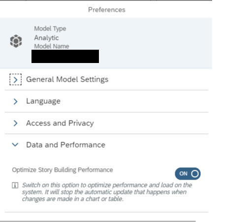
When developing a dashboard, we want to be quick and able to perform changes without too much hassle. If we are working with stories that have many objects displayed on them, we may discover that the performance of the browser decreases at the time of developing the dashboard. This is due to the automatic refreshing that SAC does when you change any property on a single object. Our objective is to avoid that, so we will enable the ‘optimize story building performance’ feature, which is already integrated with the environment but not enabled by default.
If you enable this feature, it will make your user experience when developing a dashboard much easier. How? For example, every time you make a change to the chart (such as adding a new dimension), SAC will reload the chart, slowing down your experience. If you enable this setting, the chart will only refresh once you have finished editing it. You must activate it in every model your dashboard is using. A good practice is to enable it every time you create a new model.
If you are wondering how to do it, you must go into your model and click on preferences. Then, you will have to enable the following option:
3. Enable more loaders
A slow dashboard, even if it looks and works great, can be a big hassle if it does not perform up to the customers’ standards.
SAC launches a query request to the data source for every object in the story. If you change this number and your data source provider supports the number of queries requested in parallel, it will speed up the loading speed of your dashboard dramatically. Also, depending on which kind of system you are accessing, you will run into additional settings. For example, in BW you can enable query merging.
To enable this option, you must navigate into your story preferences > query settings and check the desired options of the list:
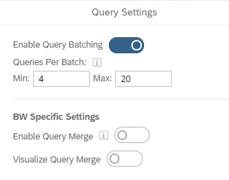
As “minimum” you want to set the least number of requests you want to perform in parallel. This might take a while since it is a bit of a trial and error process, but the positive results you will obtain are worth it.
4. Create templates to develop new stories faster
Repeating the same work over and over can be a weary task and require an unnecessary amount of effort. Thankfully, you can avoid it if you use templates based on your finished stories.
When you find a story that can be reused to develop variants of it, you can create a template. This will use the layout of the story and put placeholders where each chart and filter are situated, so it can be reused in future dashboards. This is useful when working on a project consisting of more than one screen with similar or the same layouts. When opening a template, you don’t have to worry about data source replacement since it automatically drops every model attached to the story.
5. Configure your custom colour palette in advance
Every company has its own corporate identity guidelines, make sure you know them in advance before starting to design your dashboard. Reflecting them in the design of your dashboard will make the customer feel like it's “theirs”. Before starting to develop the dashboard, design colour palettes based on those guidelines and apply them to the dashboard right when you are starting. Doing so will apply that palette to every chart you make by default, so you won’t have to be changing those afterwards.
To do so, you must go into the dashboard preferences under the charts/geo tab and set the colour palettes in your desired style. Once there, you can customize various kinds of palettes that are used depending on the chart you select.
If you liked these 5 tips to develop engaging SAC stories in an easy and time-efficient way, let us know in the comments below! There are more tips we want to share with you to optimize your experience working with SAC, we will keep you posted on those in more upcoming articles!